After reading an interview with Optigram, in a similar fashion to my previous post, I decided to look into the work of various Japanese modernist designers. This is because in the interview Optigram mirrored the view of Adrian Johnson in that they found their biggest influence came from past practitioners rather than contemporary ones.
Although I will still continue to look at contemporary practitioners, this has further strengthened my conviction that I need to widen the range of artist I look of both in terms of actual practice, ie not just illustrators, as well as time periods so as to gain a more informed and wider arching understanding of creative culture through which I will be able to effectively make links between one development and another within both the creative world as a whole as well as within my own practice.
Ikko Tanaka


I am completely in love with the work of Ikko Tanaka to the point where I am quite frustrated at the fact I've been unable to find books on him in the library or afford to by any online, despite his importance to Japanese design they seem few and far between/incredibly expensive.
The reason I am so transfixed by his work is how he effortlessly combines all the major points I've been constantly been ranting about that I want to be present within my own work: reductive image making that focuses on shape and texture that is used to effectively communicate the given content both in both through more direct approaches as well as more ambiguous ones.
Furthermore he works through a variety of different processes and techniques ranging from typography, to traditional Japanese calligraphy through to painting and printing in a way that, much like Optigram is incredibly unified and clearly part of his own visual language/creative voice.
Shigeo Fukuda


The thing that immediately strikes me about Fukuda's work is the clear link between his work and Noma Bar's once again showing the interconnected th creative industry is with clear lines being drawn from one practitioner to another. Much like Bar it is Fukuda's ability to successfully manipulate simplistic forms and negative space to effectively communicate content in a way that is incredibly reductive but not lacking in subtly or sophistication that i feel I can learn the most from with regards to my own practice.
Yusaku Kamekura

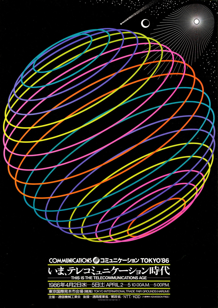

Finally, on a purely aesthetic level I have also been drawn to the work of Yusaku Kamekura. In particular it is his consistent use of highly mesmerising geometric forms, both with in his logo and posters designs, that I am drawn to given how, I have been wrestling with creating more geometric, pattern like imagery that try to included repetition and tessellation to create dyanmic and memorising visuals.
I Also think that, much like the other two artists discussed in this post, he often uses very simple yet incredibly effective and clearly very considered colour palettes that give his outcomes the best final result. This is something I need to consider more in my own work as I have learnt consistently that the wrong colour choice can throw off the intended message of an image where as the wrong choice of tonal value can throw it off balance compositionally resulting in work that is visually hard to read or simply unmemorable.
No comments:
Post a Comment