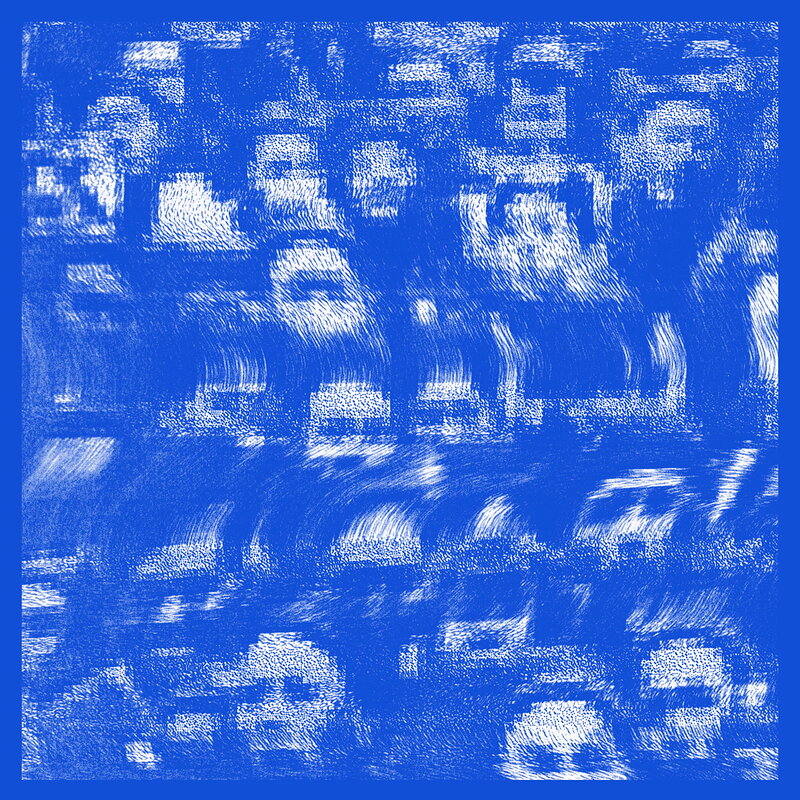
A key point of development in my creative practice came during the visual narratives module when I came across a series of interviews by designers Mathew Bell, Daniel Bartha and Jack Featherstone respectively. The first two worked together on a project to create a series of posters for Daniel Avery's Divided Love nights and talked about, although there was set theme and something they were trying to actively communicate through out, the individual spaces ie lighting floor layout etc for each place, they wanting to keep each image very minimal and ambiguous. This was so that It could, in their opinions at least, better communicate the idea of experience music in a live setting given that, although there a series of set elements each person's experience is going to be unique.

Jack Featherstone states in an interview how he similarly tries to keep his record sleeves purposefully ambiguous. To do this he often creates and image, or works from an idea that is clearly related/grounded within the music its illustrating and then further abstracts it so as to give it a more ambiguous universal feel that will, much like Matt and Dan's work, play in to the individual's own experiences and perceptions.


This idea of ambiguous imagery is something I am now continually exploring and trying to fine but that I don't feel I have completely mastered yet as I realise, especially considering what makes the work of some one like Noma Bar's work so successful, there is a fine line between being ambiguous and leaving just the right amount of elements to clearly and effectively communicate your intent and creating something that is just confusing and nonsensical.
No comments:
Post a Comment