Monday 16 May 2016

Evaluation


Leeds College of Art
BA (Hons) ILLUSTRATION
Level
04
OUIL402 Personal & Professional Practice 1
Credits
20
End of Module Self Evaluation

NAME

Christopher Cooper


1.  What learning have you inherited through this module and how has it impacted on your own understanding of professional practice? Consider yourself as a student at University as much as an illustrator

The main thing I have learnt from this module is how who I am as a person links to and informs how I work, what I choose to pursue within in it and what areas of illustration as well as art and design as a whole appeal to me. This has led me to looking into various different artist and practitioners that I am deeply interested in based on how they relate to my own intent within my work and whether or not I feel and can gain something from them in order to develop my own practice. I have also begun to consider how other aspects outside of illustration such as music and personality traits have a huge impact on who I am as a creative practitioner and what it is I am interested in.


2. What approaches/ types of research have you found most valuable over this module?
Why did they have such an impact?

The most valuable form of research over this module has been secondary research in the form of online articles and blogs as well as taking out various books from the library. I find this particularly useful as it allows you to seek out and gain an in depth understanding of the practitioners you are interested in. This is achieved through being able to extensively analyse individual images, as well as practitioners portfolios on a whole in terms of what it is their intent is, what content are they communicating and how this grounds their output, whether or the context in which the work is viewed has impacted decisions the artist has made as well as analysing the overall aesthetic of their work and why it appeals to me.


3. In what way has PPP informed the way your work in other modules and your illustration practice as a whole?

It has informed my work in other modules through the way in which it as expanded on my process of analysis of imagery, both in terms of that of other practitioners as well as my own work. Particularly it has got me questioning within the other modules how certain aesthetic choices such as colour, shape, texture etc impact upon the tone of voice of a piece of work and how this can alter the intent in terms of what content is being communicated through it. Furthermore it has allowed me to more carefully consider where exactly I want to push my work in relation to a specific professional practice such as graphic design and print making and how looking at specific groups of practitioners can inform how I answer the briefs in relation to this.


4. What weaknesses can you identify in your PPP submission and how will you address this in the future?
The two main weaknesses within my PPP submission are my Illustrated self response as well as the types of research I did. Firstly I feel I didn't effectively or exhaustively explore ideas and media in relation to studio brief 2 to the same extent I have done in other modules, particularly those contained within studio practice. Subsequently I feel my final outcome was neither conceptually, in terms or content and communication, nor aesthetically as successful as it could have been. Finally although I think the research I did was highly informative, carrying out more primary research such as going to galleries as well as documenting and analysing more of the big heads talks would have given me a better understanding of professional practice and where I want to go in relation to my own practice.


5. What communities of practice and professional contexts do you intend to investigate further as you approach level 5? Why do they appeal to you?

As I approach level 5 I want to investigate more into practitioners that operate between the boundaries of graphic design and illustration particularly within the context of print making. This are of professional practice interests me due to the fact that often it involves using reductive/minimalist aesthetics to more clearly and concisely communicate content. This is something I have found myself constantly exploring within PPP and trying to achieve visually within my other modules and therefore investigation into it I feel will help expand my own practice and steer it more to a point where I am happy with what it is I am doing.


6.How would you grade yourself on the following areas:
(please indicate using an ‘x’) 

5= excellent, 4 = very good, 3 = good, 2 = average, 1 = poor

1
2
3
4
5
Attendance


X

Punctuality


X

Motivation


X


Commitment


X


Quantity of work produced

X


Quality of work produced

X


Contribution to the group

X


The evaluation of your work is an important part of the assessment criteria and represents a percentage of the overall grade. It is essential that you give yourself enough time to complete your written evaluation fully and with appropriate depth and level of self-reflection. If you have any questions relating to the self-evaluation process speak to a member of staff as soon as possible.
Final Presentation Slides and Notes

Acclimatisation 

As discussed in the interim presentation the main shock to my system in terms of moving to a new place hasn't been getting used to a city life or gaining independence given that I'm from a city of of a similar size only 40 minutes away by train and that prior to university I had a lot of independence already. Therefore the biggest factor in terms of settling into a new place was the more social aspect of things. Given that I'm a very independent and rather introverted individual I am used to just getting on with things in my own, often very insular way. Living in halls as well as enrolling in a reasonably large course with a strong feel of creative community has forced me to come out of this shell a little bit in terms of how I interact with other people.

Image Making:
Drawing, Shape and Texture

Over the year I have seen my approach to image making, particularly how I draw and what exactly drawing means as a process and tool, evolve to a point where it is quite far removed from what I was doing at the start of the year. In particular I found visual language to be of fundamental importance in terms of allowing me to question what I am doing, why I am doing and what processes I under take which has resulted in me beginning to home in on and refine my personal tone of voice.
Evidence for this can be seen in my switch from stale, lifeless and rather clumsy sketching from the start of the year to more fluid and reductive drawings produced later on. This has also led me to pursuing more simplistic, graphic imagery through the use of shape and texture an expect which is now at the centre of my practice. 

Process/roughing

With all this in mind I have also began to refine my actual work process. Often this involves initial visual responses to a given idea that I will then repeat several times with different media and processes so as to gain a better understanding of what materials, composition and tone best communicate the content of my work.

Furthermore I have consistently found creating final finished pieces that live up to the required standards particularly challenging as I often work quite roughly and free within my sketchbook. Therefore the process of roughing has been of fundamental importance in helping me tackle this as it helps me to refine and control these idea through giving me a better understanding of how they will work within the given parameters of the final piece. 

Content and communication:
Research 

Although I already saw communication as being a fundamental aspect of illustration, as the year has progressed it has become a bigger and bigger art of my work with content being the main driving force of individual responses to the set briefs. Therefore research has been of fundamental importance to my practice in terms of generating this content. I believe this is probably the most important skill I have developed all year as it has allowed me to gain a better understanding and therefore produce more informed, appropriate and in general more successful responses to the briefs. 

Ambiguity and Reductive Imagery

In terms of actually communicating my content I have found myself pushed to a more and more reductive way of achieving this. This is because I believe the simpler an image is/the fewer elements it has the more effective it is in communicating your intent given how its conciseness will lead it to being more readable, memorable and instantaneous in delivering its message.

On the flip side of this I have also begun to consider how ambiguity within my imagery can better convey my intent through allowing me to show abstract and complex themes in a more reductive manner as well as allowing me to play into and let individuals own beliefs, views and general perceptions alter how they see my work.

Promotion

On a personal note I have also began promoting nights in my home city of Sheffield with two close friends. This has been a huge undertaking and has expanded on many skills such as networking, organisation, time keeping and creative direction. In particular, coupled with the first point about acclimatisation it has forced me out of my comfort zone and got me to improve my networking skills through artist liaison/socialising with the people we book which has increased confidence socially which I believe has carried through to others aspects of my life.

Furthermore, as often highlighted by visiting lecturers/bigheads talks, it has made me realise that if you want to do something you should just do it. Things don't just happen by themselves but that if you put the time and effort in to making things for yourself opportunities will soon arise. This is something I need to carry through into my creative practice as I move through to level 5.

Finally it has also greatly informed my on going debate as to how I define success. Although our nights are going well we cater to a very niche often obscure area music and night life which has resulted in our nights usually just breaking even. In a business sense this wouldn't seem very productive as, although we aren't losing money we aren't making any either. However despite this the endeavour has in my view been a success but just in different ways such as being able to create the atmosphere we wanted in terms of music and general energy that we wanted and that we felt was lacking in the Sheffield night life. Again this is something I need to consider in how a see success and my own practice in relation to the creative industry.

Time/Management

With this in mind I have found this year a constant struggle to keep on top of things and at times, now for example, I have felt completely burnt out and run down. This has greatly impacted on my last two submissions, particularly COP and is something I need to seriously need to address next year. However I realise it will be hard as the work load is only going to increase and at this moment of time I don't want to sacrifice other personal endeavours such as promotion due to the amount of personal growth and fulfilment I feel I am able to gain from them.

Top Tip: Question Everything

The most useful piece of advice I would give to a student enrolling course would be to question everything. Primarily this would be in relation to yourself as a practitioner as I feel constantly analysing what you are doing and why is the main why by which you can refine and evolve your process as well as grow creatively. However more than this I think it is important to, although perhaps not too much as it can be overwhelming, question other aspects of your life such as what you choose to do and why so as to further expand your understanding of the world around you and how you relate to and function within it. 


The illustrated self: Final image


In the end I decided to go for the super reductive version of the face being supported by a book with the gramophone moving round it. This was meant to include the elements of content/research and music in a way that would reflect there relevance to my practice. For example I have found that time after time research forms the foundation of my responses in studio practice and therefore felt that having a book support the rest of the face would be away to clearly communicate research and content being the foundation for my creative practice.
In a similar manner I decided to have the gramophone curving round as I feel music is something that encompasses all aspects of my life as well as just my work process so therefore felt this would best show this.
I drew painted the final image out and scanned it in so that I could add various textures on top of it digitally. This was because, aesthetically shape and texture is something I have come back to time and time again is the key aesthetic component of my practice that links my work. However more than this I wanted to try and communicate how process/media experimentation drives my practice in a way that wasn't as simple as just drawing different tools and media around the main element of the image. Therefore I created various different textures in a variety of different mediasuch as paint, block printing ink and brusho to that I then scanned in and applied on top of the image using photoshop so as to include the aspect of process/experimentation within my work.


Overall I feel the final image does successfully communicate my intent, however I think the use of really obvious motifs such as the book and gramophone, although clear is perhaps too clumsy. Furthermore although I think it reflects the reductive approach I am trying to execute within my practice it isn't perhaps as successful in showing this as other work I have produced such as that for Persons of note in the Visual Communications module. This is because I think it feels far too static and the individual elements neither react with each other or the negative space around them in a manner that is dynamic which has resulted in a final piece that feels more empty than reductive.


Sunday 15 May 2016

The Illustrated Self: Visual development


Initially the first thing I needed to do for this brief was choose what it was that I would have as the main element for this image. Although it seems obvious I want to have a human profile as the main feature so therefore decided to initial start sketching out and trying to reduce down the elements of the face to the most basic form.

I was careful to include certain aspects of the face, such as the eyes, so that it would still be recognisable yet make sure the decision not to include certain bits added to the over all message of the image. Therefore I decided not to include the mouth as I thought it would help communicate my introverted nature, a quite abstract concept that is quite difficult to subtly and effectively communicate visually. 


I then drew out some more final versions with the face being cut in two/deconstruction so as to reveal various different elements inside. At this stage I am not one hundred percent sure what I want these elements to be although I realise from the previous posts that music, experimentation and content/research, alongside the reductive approach to image making I am currently exploring, are probably the most most important aspects of my practice.


Therefore I decided to do some roughs including various different motifs such as gramophones and books so as to try communicate these aspects of myself.


The illustrated self: Ekta and Icinori

Ekta

photoFigure Series, 2011 – Ekta

When thinking of how to solve this brief in the reductive manner intended the work of Ekta immediately sprang to mind. This is because his reductive approach to form as well as use of texture's is something I feel I can employ within my own response to communicate my practices focus on shape, texture and reductive approaches to image making and visual communication.

Furthermore I feel I can be quite ambiguous using a similar, abstract approach which in turn could be used to communicate other aspects of my self such as my open mind, love of music and introverted nature. However I realise this could become too confused and therefore certain motifs may need to be included to better communicate my intent.

Icinori

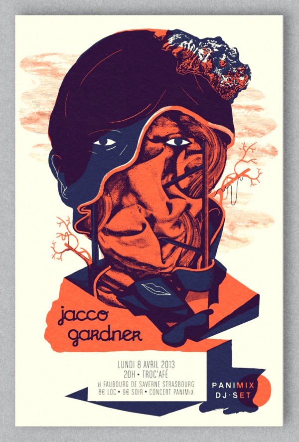
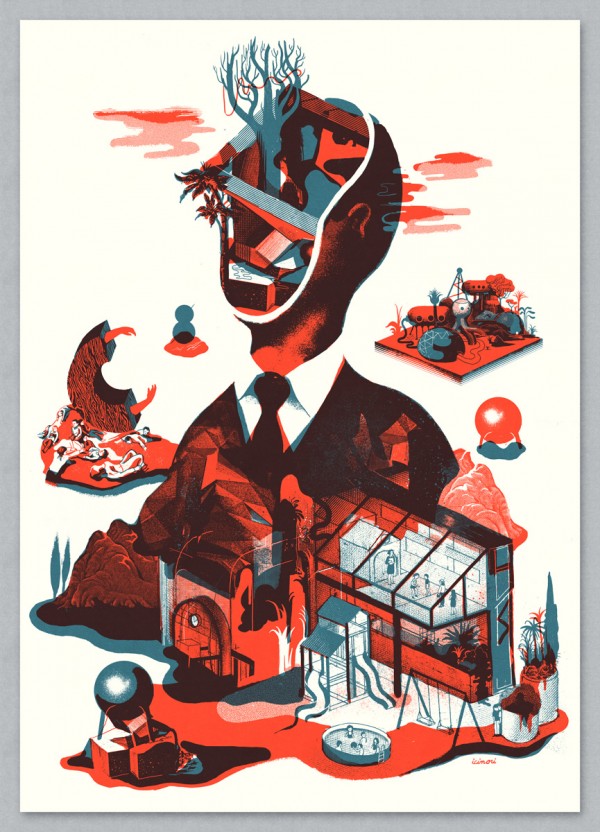
jacco gardner_FBELCAF8 rough_psd43

The illustration due Icinori's work often comprises of one main element, for example int he above images a figure, that has been constructed with lots of other smaller elements interacting with and being contained within it. This results in very complex images on the whole that are in fact comprised of many smaller simple elements. I feel a similar approach of deconstruction of a central image alongside smaller motifs/elements could be combined with the approach discussed above in regards to Ekta in order to make a response that effectively communicates the key aspects of myself in a way that is reductive without discarding too much of the needed visual information.
The illustrated self: initial thoughts and planning

Despite being described as a 'fun' brief i think this is an incredibly challenging brief. This is due to the fact that as both people and creative practitioners, there are many different aspects that make up who we are. Therefore trying to make a single image that communicates effectively who we are and what we do is going to very difficult.

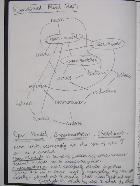
With this in mind I thought the best place to start out would be listing words that describe me and my interests as a person, creative and student and put them into a mind map to see what links there were.


As expected the full version of my mind map contained fair too many elements to effectively transferred into one image, therefore I decided to focus on what I felt were the most important aspects given the number of connections each word had as well as how pertinent I feel the particulalry word is to myself as a person and practitioner.
Once this was done I decided to do another more condensed map showing just these words and the connections between them.


The most important aspects of my practice therefore were having an open mind and experimentation, both in terms of process and my approach to communicating intended ideas within my work.
Other key aspects I felt were also my focus on content driven work the backbone of which being the various forms of research I have undertaken over the year.

On a more personal level I felt both my love of music and introverted nature are the two fundamental aspects of who I amwhen you try to condense everything down to the bare minimum.

Given all that I have discussed within this blog, the work that I have undergone in studio practice and the explorations made in the above mind maps I have decided that whatever way I choose to answer this brief it needs to be done in a reductive manner so as to best reflect my practice. This sentiment is something that was also shared by the tutors in the initial group crit/feedback session on our ideas.
Japanese Modernist Design

After reading an interview with Optigram, in a similar fashion to my previous post, I decided to look into the work of various Japanese modernist designers. This is because in the interview Optigram mirrored the view of Adrian Johnson in that they found their biggest influence came from past practitioners rather than contemporary ones.

Although I will still continue to look at contemporary practitioners, this has further strengthened my conviction that I need to widen the range of artist I look of both in terms of actual practice, ie not just illustrators, as well as time periods so as to gain a more informed and wider arching understanding of creative culture through which I will be able to effectively make links between one development and another within both the creative world as a whole as well as within my own practice.

Ikko Tanaka


I am completely in love with the work of Ikko Tanaka to the point where I am quite frustrated at the fact I've been unable to find books on him in the library or afford to by any online, despite his importance to Japanese design they seem few and far between/incredibly expensive.

The reason I am so transfixed by his work is how he effortlessly combines all the major points I've been constantly been ranting about that I want to be present within my own work: reductive image making that focuses on shape and texture that is used to effectively communicate the given content both in both through more direct approaches as well as more ambiguous ones.

Furthermore he works through a variety of different processes and techniques ranging from typography, to traditional Japanese calligraphy through to painting and printing in a way that, much like Optigram is incredibly unified and clearly part of his own visual language/creative voice.

Shigeo Fukuda


The thing that immediately strikes me about Fukuda's work is the clear link between his work and Noma Bar's once again showing the interconnected th creative industry is with clear lines being drawn from one practitioner to another. Much like Bar it is Fukuda's ability to successfully manipulate simplistic forms and negative space to effectively communicate content in a way that is incredibly reductive but not lacking in subtly or sophistication that i feel I can learn the most from with regards to my own practice.

Yusaku Kamekura


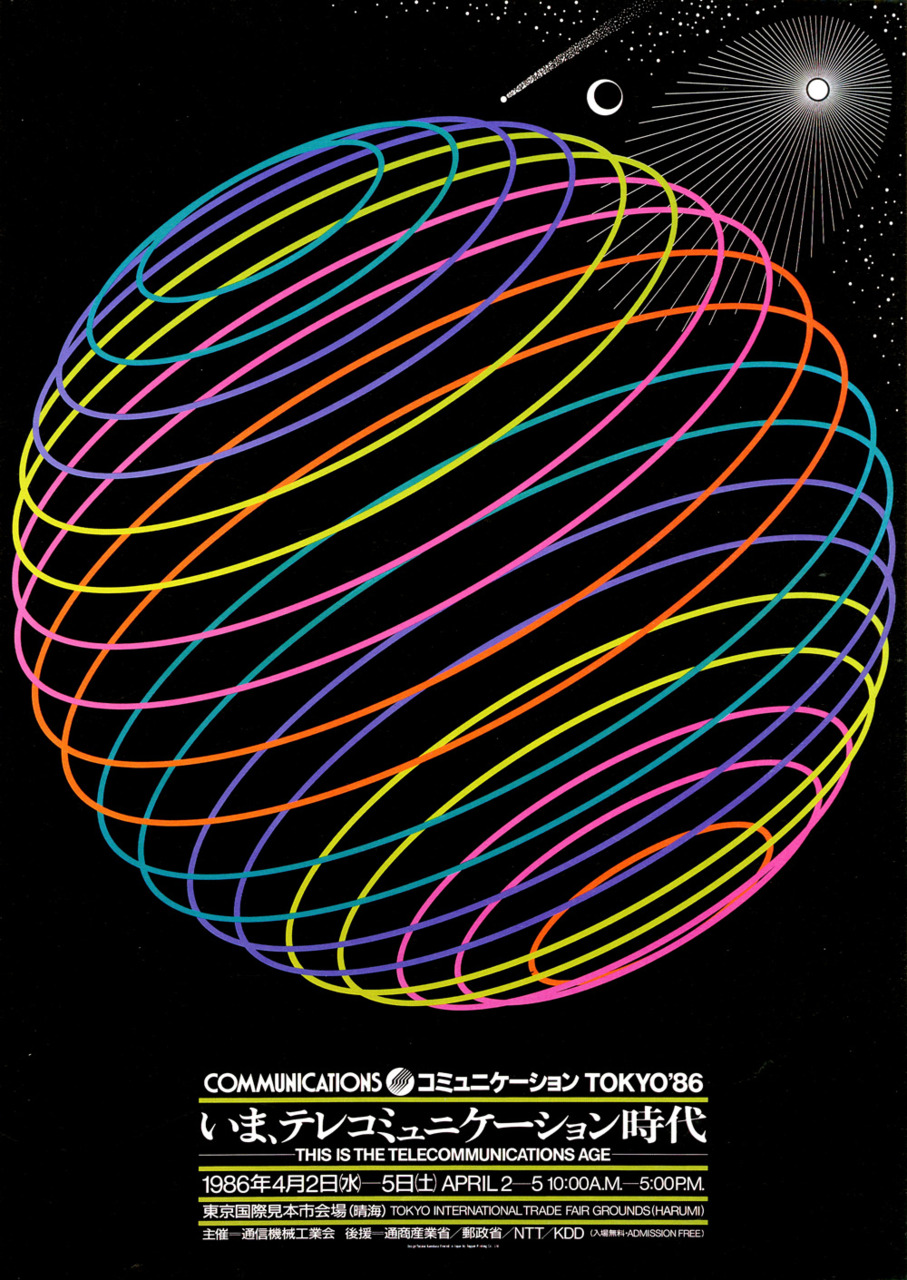
Finally, on a purely aesthetic level I have also been drawn to the work of Yusaku Kamekura. In particular it is his consistent use of highly mesmerising geometric forms, both with in his logo and posters designs, that I am drawn to given how, I have been wrestling with creating more geometric, pattern like imagery that try to included repetition and tessellation to create dyanmic and memorising visuals.

I Also think that, much like the other two artists discussed in this post, he often uses very simple yet incredibly effective and clearly very considered colour palettes that give his outcomes the best final result. This is something I need to consider more in my own work as I have learnt consistently that the wrong colour choice can throw off the intended message of an image where as the wrong choice of tonal value can throw it off balance compositionally resulting in work that is visually hard to read or simply unmemorable.


Roots: Paul Rand

Another key point that struck me from the talk with Adrian Johnson was the importance of looking at past practitioners work. I think that, although website sites such as It's Nice That are incredibly useful for finding a wide variety of amazing practitioners and helping to home in on what you want to achieve with your own work I think they often result in a very insular approach to illustration in that you become quite focused on only contemporary illustration/design.

After Adrian Johnson talked about how his hero is Paul Rand it made me realise I needed to start looking more into who or what motivates and informs the contemporary practitioners I'm looking at currently.


Therefore I decided a logical place to start would be with Paul Rand. It is no surprise that Johnson has such an admiration for his work as I can see that it relates to the same minimalist/reductive approach that we are both trying to achieve with in our work. I find it particularly amazing just how timeless his designs seem which in part is due to his background in the modernist design movement yet at the same time I think his work is a lot more playful and risque than that of some of his contemporaries.


Again I think it is the way he is able to subtly communicate his content through the use of a minimal amount of elements executed through a variety of different approaches to create a very striking and unified body of work that I find myself drawn to. As I keep stressing, I think the main things I need to work on are getting the right balance between content and reductive image make as well as creating a sense of unity between the various approaches and processes that I use.


Adrian Johnson: Big Heads

Out of all the big heads talks we've had this year I found the Adrian Johnson one the most enlightening. Although the others were all very interesting, particularly the Glynn Dylan one which I actually found more enjoyable, I felt most in tune with him as a practitioner. This may already be obvious from posts I've made previously my studio practice blog due to how his incredibly reductive/minimalist approach to image making and composition mirrors what I am trying to achieve within my own work.


I found his opinions on the state of illustration as well as how to balance success with an individual creative voice particularly informative. Having had a long career, over two decades, he's seen a lot of fads come and go but has always felt he was on the outside of them but that despite this, in fact possibly in light of this, he has always found work despite not fitting in wiht what was considered 'cool'.


However he also stressed that despite this 'success' he's had various points of creative stagnation that have led to him reinventing and re-evaluating his own practice. In particularly he talked about how creating work that he felt others would like or that would be commercially viable and be able to get him commissions and therefore a stable living led to a complete stagnation in his creative process. This feels incredibly pertinent to where I want to take my own practice as I am constantly thinking about what I actually want from my practice in the future given that I realise I will have to find a niche for my own particular creative voice or risk sacrificing certain aspects of my work and process.

AJ_vessels_1.jpg

However despite this he did stress that no matter what you define as success for yourself the most important aspects to achieving it are both working hard and being proactive in trying to find opportunities and making things happen for yourself. This last point was something that has been consistently stressed by all the big heads interviewees and guest lecturers that we've had and therefore is something I need to keep at the forefront of my mind as I progress through this course particulalry once we start live briefs.


Optigram

Given that music is such a huge element within my life and how I define myself as an individual, I often find aspects of it being drawn into my work and subsequently find myself drawn to contemporary practitioners, mainly designers, who work within this creative sphere. Currently one of my favourite practitioners is Optigram. This is due to the wide range of media processes and ideas he explores when responding to a given brief that, despite being incredibly varied, still feels unified and carries his own particular tone of voice.

  Kode9 & The Spaceape,  Black Sun   Optigram exhibition,  Reversions
 Kode9,  Nothing   Harmonic 313,  When Machines Exceed Human Intelligence

As previously stated on my blog a huge part of my practice is the wide range of ideas and processes I explore but, unlike Optigram, I feel like my over all output feels completely muddled and all over the place and therefore I need to refine both my techniques and intent to achieve a more unified voice and portfolio of work.
Ambiguity

A key point of development in my creative practice came during the visual narratives module when I came across a series of interviews by designers Mathew Bell, Daniel Bartha and Jack Featherstone respectively. The first two worked together on a project to create a series of posters for Daniel Avery's Divided Love nights and  talked about, although there was set theme and something they were trying to actively communicate through out, the individual spaces ie lighting floor layout etc for each place, they wanting to keep each image very minimal and ambiguous. This was so that It could, in their opinions at least, better communicate the idea of experience music in a live setting given that, although there a series of set elements each person's experience is going to be unique.

Matt_and_dan_divided_love_its_nice_that_1


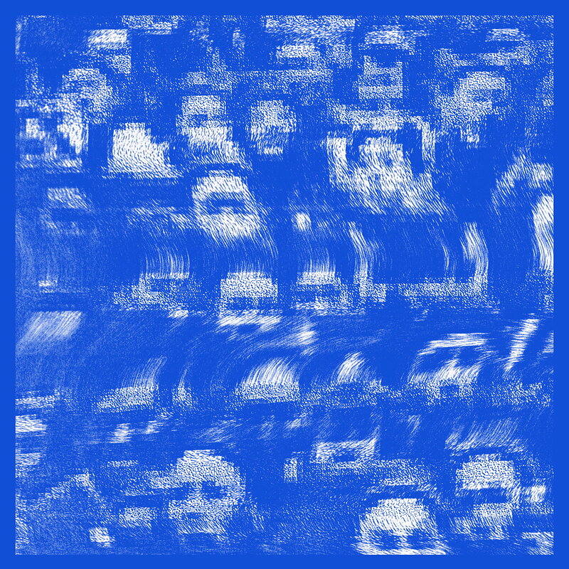
Jack Featherstone states in an interview how he similarly tries to keep his record sleeves purposefully ambiguous. To do this he often creates and image, or works from an idea that is clearly related/grounded within the music its illustrating and then further abstracts it so as to give it a more ambiguous universal feel that will, much like Matt and Dan's work, play in to the individual's own experiences and perceptions.


This idea of ambiguous imagery is something I am now continually exploring and trying to fine but that I don't feel I have completely mastered yet as I realise, especially considering what makes the work of some one like Noma Bar's work so successful, there is a fine line between being ambiguous and leaving just the right amount of elements to clearly and effectively communicate your intent and creating something that is just confusing and nonsensical.
Poster Study task and evaluation

As a creative:


I think the stand out aspect of my practice is my willingness to expect and explore to media, processes and ways of thinking within my work. What this often leads to is wide range of different processes and ideas being explored within my sketchbook with, in my own opinion, final pieces that aren't quite as refined or as high quality as I would like them to be. Therefore I thought it would be good to make my poster in response to these two conflicting points as they are both the best and at the same time worst flaws of my creative process and practice.
With this in mind I decided to play into the age old saying of jack of all trades master of none as I feel it best summerises myself as a creative. To illustrate this Idea I decided to depict a rather simplistic/reductive human figure holding a variety of different tools.

As a person:


Given the content of my first poster, i decided I would create all three posters with a theme of self deprecating humour. Therefore for personal I decided to depict what is one of my worst flaws and at times most overwhelming trait as a human being: anxiety. I have long been at terms with this part of my personality and am more than happy to joke around about it despite the seriousness of the subject matter. Furthermore I have come to accept that, although it causes me a lot of pain at times and is highly taxing on me both physically and mentally it is at the centre of who I am, how I think and how I view the world. Particularly I think the constant process of analysis that goes through my head in relation to almost everything I think, hear, see or do is fundamental to how I work creatively.

My aspirations:


Finally when thinking about over all aspirations, the first thing that came to my mind, along with many others studying creative courses, was the desire for success within the creative feel given just how hard it is to make a living from it, let alone gain any fame/notoriety. With this in mind what actually constitutes success within the creative field is something that is rather hard to define and effectively achieve.

Therefore I decided to depict a character holding a sign saying will draw for food, implying homelessness/desperation to use his talents/skills for food implying that although my aspiration is 'to make a living from my creative practice' what exactly this will entail or whether or not it can be considered as a success is something much harder to determine.

Evaluation

After the feedback session the main points were as follows:

-All three work very effectively as a set. This is due the use of consistent elements such as the same simplistic character, same bold, black font against wait along with the stripy background.

-Furthermore despite using the same elements all three depict the figure from different perspectives: full body, mid range shot and close up that makes each poster look clearly distinguishable from the other whilst still working effectively as a set.

-Nice use of humour that eludes to the deeper meanings behind each poster although in the stresses over everything poster the motif of steam running out of the characters ears could have been clearer, looks too much like liquid.

-There is a nice sense of balance in all three given how each comprises of three main tones, black character and text, white highlight against text and then stripy back ground that serves as a mid tone.

-Jack of all trades is the worst visually and conceptually, Despite clearly communicating my intent it was perhaps a bit too obvious and ham fisted. Furthermore visually it feel less dynamic and empty than the other two.

-The best, both aesthetically and conceptually was the last poster. This is because it effectively and humorously plays into what is simultaneously a hope and fear of all people still within education have: whether or not we will be able to succeed and make a living from our chosen field.

Aesthetically the composition was given as the reason for being the strongest. It had the best sense of balance and contrast given how the central figure fitted nicely within the page and an effective contrast between him and the text was achieved through the use of a much larger white space than was used in the other two posters.


Leeds College of Art
BA (Hons) ILLUSTRATION
Level
04
OUIL406 Visual Communication
Credits
20
End of Module Self Evaluation

NAME
Christopher Cooper


1.  What have you learn about visual communication during this module and how effectively do you think you have applied these ideas?

The main point learnt about visual communication is that content is without doubt the most important aspect of successfully communicating ideas. By this I mean that, despite everyone being given the same briefs, it was all about researching and generating our own content which in turn could then be boiled down into a few key ideas and concepts which we would be attempting to convey through our work. This has highlighted to me that the process of both visual communication and well as the creative practice in general is something that should be individually driven to reflect your own desired intent.

In terms of actually communicating content the main point I repeatedly found myself coming back to, particularly when things weren't working, was that less is usually more when trying to convey meaning. Essentially if you can effectively reduce your images down to only the essential information that they need to say, the result will usually be something much more effective and concise it its deliverance of a message as well as giving it a much more memorable and dynamic aesthetic.


2. What approaches to/ methods of image making have you developed and how have they informed your concept development process?

This module has helped me develop a wide range of methods of image making through the various format requirements, ie gifs, vectors and images for print, that varied from brief to brief. Although I found it incredibly difficult and frustrating I think developing my skills with vectors was particularly useful given their importance in creating digital work within a professional design context.  
Furthermore the various different formats have forced me to adapt and later both my image making process and ideas development to their inherent restrictions so as to create work that is most appropriate to the given format. As state before this has often lead to a more reductive work process whereby I have tried to make my work say more with less.


3. What strengths can you identify in your work and how have/will you capitalise on these?

As with other modules I think my willingness to experiment, particularly in the first and third brief as resulted in a very varied and interesting body of work. However unlike in previous modules I think the main way I was able to capitalise on this experimentation was through taking a step back and refining my image making process into something that translated more effectively into a final outcome. This has been something of an issue both in this module and others, such as 404 and 405, and which I feel in the final brief: Persons of Note, I was able to effectively resolve.


4. What weaknesses can you identify in your work and how will you address these in the future?

A major issue was the lack of visual consistency in my first two briefs although it wasn't actually required for the first and I would argue that exploring different visual aesthetics and images making processes at the beginning of this module helped me expand my initial skill set. However with the second brief it was a major pitfall but one that I feel a addressed in my final brief. This resulted in a set of work that was much clearer in its conveyed meanings than that of the work produced for Greetings from.

In general I think my second brief had a lot of issues, particularly in terms of transferring rougher, hand developmental work into more refined digital outcomes. More roughing as well as digital development within Illustrator I feel would solve these issues in the future.


5. Identify five things that you will do differently next time and what do you expect to gain from doing these?

Rough more effectively in all my briefs. This will allow me to transfer developmental work in to final outcomes more effectively and concisely.

Explore more types of research, particularly primary. Although I was happy with the level of research conducted within this module I feel I could have generated more content and gained a greater in sight by carrying out primary research such as that which I conducted for Visual Narratives.

Explore different methods of printing my final out comes. I feel for the last brief my final out comes would have benefited greatly from being screen printed due to the subtle textures and inconsistencies the process gives your work.

Be more ambitious in what I would like to achieve with my final outcomes. This is not to say that I haven't done so during this module but rather that I feel like this module has helped me develop and refine a core set of approaches and techniques to visual communication in terms of image making, idea development  and working within a given format and that in the future I will be able to independently select and further push the required formats for a given brief.

Play with and bend the briefs more towards my own intent as a visual practitioner. Although I feel like I did this to some extent, much like the above point, I feel like now that I've established this core skill set and began establish where I want to be with regards to my own individual creative practice I will in future be able to better work with briefs to match my own intent which I think will in turn result it more successful, engaging and original responses to them.


6.How would you grade yourself on the following areas:
(please indicate using an ‘x’) 

5= excellent, 4 = very good, 3 = good, 2 = average, 1 = poor

1
2
3
4
5
Attendance


X


Punctuality


X

Motivation


X
Commitment


X

Quantity of work produced


X


Quality of work produced


X


Contribution to the group

X


The evaluation of your work is an important part of the assessment criteria and represents a percentage of the overall grade. It is essential that you give yourself enough time to complete your written evaluation fully and with appropriate depth and level of self-reflection. If you have any questions relating to the self-evaluation process speak to a member of staff as soon as possible.