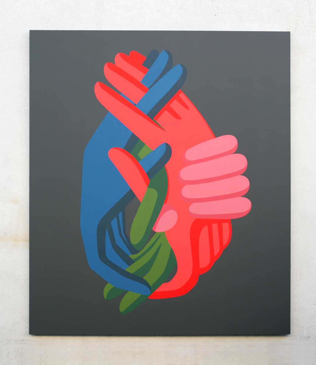
Monday 28 September 2015

Who am I? Why am I here? 

Geoff Mcfetridge


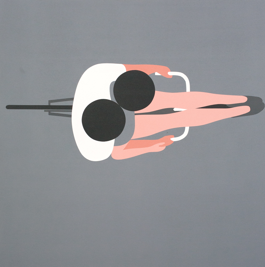
-Geoff Mcfetridge has been one of my favourite professionals operating within the world of illustration and design for several years now.
-For me the main draw to his work is his ability to communicate so much so clearly in a way which is both simple in design and immediate to the viewer.
-This is usually achieved through his minimalist approach to image making choosing to break figures and objects down into a series of basic shapes. However I feel it is his mix of subtle humour alongside masterful use of composition that truly set his work apart from others.
-These are aesthetics and approach image making have subsequently transferred to my own work. I feel this is indicative of my background in graphic design (having carried out work experience placements within a design studio in Sheffield during my Summer holidays) which has resulted in a tendency to seek out work that falls some where between illustration and graphic design.
-However I have decided, after having Geoff Mcfetridge recommended to me during the opening 'Mega Crit', that I need to in future expose myself to individuals/professionals operating at the other end of the wide reaching spectrum of illustration. This is so as to try and gain a more individual tone of voice as the fact that I was recommended Mcfetridge's by strangers who have no knowledge of my background or preferences would suggest that there is perhaps too much of his work in my own.


Images re-blogged from: http://championdontstop.com/site3/gm.html


Sunday 27 September 2015

La Boca - It was on Earth that I knew joy (film poster)


(re-blogged from http://site.laboca.co.uk/It-Was-On-Earth-That-I-Knew-Joy)

Context

-Poster created for the release and promotion of a short film.
-The film itself is short in duration and lacking any solid plot line meaning the image would have to communicate a key concept rather than narrative.
-Film was screened at a variety of independent film festivals
-Therefore the image would have to work well/be legible from a distance so a s to draw in viewers
-It would have to be able to convey the themes of the film in a way that is immediate enough to leave a lasting impression on people passing by.
-Furthermore the posters at such festivals are usually sold on as one off prints during the festival so the final piece would also have to work as a bespoke piece of artwork.

Ideas

-The film is a piece of surrealist science fiction.
-It depicts a series of scenarios  that all focus on the manipulation and subversion of both the individual and society due to external influences.
-These include the use of prescribed medication, outbreak of disease, the power of technology and use of propaganda.
-Therefore the image has been created in a style reminiscent of seventies science fiction films and b movies.
-This was achieved through the choice of typeface, minimal colour way and over all graphic aesthetic of the image all of which give a very retro feel to the image.
-The main idea behind the image is that of the hand of an external and unseen figure inserting something into the head of a man.
-This conveys the main concept of the film that is simple, immediate and effective.
-Particularly the decision to make the hand both off centre and contrasting in colour and tone to both the figure and background helps illuminate it from the rest of the image giving the viewer the sense that this is where the power lies.

Image

-A variety of methods could have been made to create the final image.
-This is due to the fact that La Boca's portfolio contains work created with a variety of different approaches and media.
-Given both the aesthetic (block colours sitting upon a textured background) and context of the image (film poster) I think the final piece was screen printed.
-However the image could have also been made through the use of paper cut outs. Both the grey hand and the deep red of the background, whilst been block colours, have a consistent and distinct texture running through them that would suggest the use of textured paper.

-


-