Friday 20 November 2015

Scott Bakal: A highly emotive and human approach to Illustration

Scott Bakal's work has really been imprinted into my mind after seeing it in  magazine. After reading a pretty in depth interview with him and seeing his online sketch books I came to realise just how much dedication and effort he puts in to his work. This really comes across in how exquisitely crafted his work is which is testament to just how deep his understanding of media and process is. Once again this serves to highlight the importance of keeping and regularly adding to a sketchbook as well as repeating and refining images and process until you have it right.

twoheads.jpg
Woman-Green.jpgbeachhat.jpg
(All the above images taken from his sketchbook which he often publishes online to document his work process)

This has resulted in a highly personal and human feel to his work all of which is created using traditional/analogue media. When this is coupled with his genuine desire to gain a deep understanding of the subjects/concepts he is illustrating has allowed him to consistently create highly informed and emotive pieces of illustration. Furthermore he seems to be able to effortlessly produce work that communicates both incredibly subtle and glaringly obvious messages. This demonstrates how invaluable versatility as an image maker and communicate can be (something Kyle Webster also touched upon in his Big heads talk) as this arguably the reason he has managed to be so prolific and diverse in terms of who/what he's produced work for.

07-0829-blue-cloud-02.jpg11-0815-WSJBank.jpg
(Left: A piece entitled social anxiety, Right: 'Shady Banks' illustration produced for an article in the New York Times. Both very simple and direct in their messages)

14-0501NYTBaby.jpg

(Illustration for an article called Hurt Before Before about oxygen deprivation in new born babies. A lot more subtle in its message than the previous two images choosing to juxtapose the negative aspects of the events that occurred during birth and the hope all parents will feel for their children regardless of the situation. I thought this was a particularly emotive and moving response to a very difficult subject matter. http://well.blogs.nytimes.com/2014/05/05/hurt-before-the-birth/?_php=true&_type=blogs&_r=1)
Illustration Next:
Ekta and Olimpia Zagnoli


(cover art Ekta)

After reading the book Illustration Next I was particularly drawn to the work of Ekta and Olimpia Zagnoli. Both have a very simple aesthetic to there work that revolves primarily around the use of shape. This serves to create very dramatic images that leave a very direct and instant impression on the viewer. The interaction between the shapes and their placement/composition within the pieces is particularly striking and is an aspect of my own work that still needs a lot of improvement.
photo 

(Right: Ekta, Left: Olimpia Zagnoli)

However despite this their work and methodology is distinctly different. Part of this may be due tot hat fact that Ekta is primarily a fine artist. This shows through he work in that it seems much more personal, often serving as a personal reflection on the world around him although he still does produce commercial illustration. What particularly strikes me about his work is his use of complex textures within otherwise very simple shapes that create a certain warmth and intrigue to his work. This is something I personally am very interested in and am currently exploring ways of achieving this within my own practice.

llustration for an article by Jonas Hassen Khemiri published today in The New York Times, Sunday Review. 
Read it HERE


(Right:Several portraits produced for a solo exhibition, Left: Illustration produce for the New York Times Review)

However I think it's Olimpia Zagnoli's work that resonates the most with me. Perhaps due tot he fact that she is more deeply involved with commercial illustration than Ekta, her work is very much ideas driven. Furthermore, given her reductive approach to image making and composition, her work is always very clear and to the point in how it communicates a given message. Her work really does embody the ideas that a picture speaks a thousand words which arguably is what all illustrators are trying to achieve within their own practice. This simplicity and directness in regards to visual communication is something I really need to take on board and apply to my own work given my tendency to over complicate ideas and in some cases misdirect the meaning of my images through poor composition and use of certain motifs.


(Left: Mathematicians are story tellers, produced for Italian news paper La Repubblica, Right: Weather and Violence, As temperatures rise, tempers flare, produced for New York Times Sunday Review.)


Monday 16 November 2015


Monday, 16 November 2015


Leeds College of Art
BA (Hons) ILLUSTRATION
Level
04
OUIL403 Visual Skills
Credits
20
End of Module Self Evaluation

NAME


1.  Which practical skills and methodologies have you developed within this module and how effectively do you think you are employing them within your own practice?

The use of roughs has been invaluable for me when generating initial ideas and until starting this course was a process I rarely used. It has allowed for the quick and exhaustive generation of ideas as well as developing and understanding how they will transition into a final image.
I have also tried to use as many different media and processes as possible. These have included both analogue methods such as charcoal, ink, acrylic, papercut and graphite as well as digital skills such as photoshop. I have tried to push myself out of my comfort zone as much as possible and would site paper cut and the use of photoshop as particular examples of this as I rarely use them for illustrative purposes.
Although I feel I have improved to an extent with these mediums I realise that I still have a long way to go yet as I don't feel they have always been as effectively employed within my image making as thye could be.

2. Which principles/ theories of image making have you found most valuable during this module and how effectively do you think you are employing these within your own practice?

The importance of drawing out as many potential Ideas of as possible as well as repeat drawing images regardless of how rubbish they are has been invaluable. This was achieved through my use of roughs which I seemed to have been drawing endlessly throughout the project.
Furthermore the importance each aspect of image making, ie composition, design, colour, quality, has on delivering the message of an image. This means it's not always enough to create something which simply looks good as the wrong composition or colour combination, even if aesthetically pleasing, can completely distort the intended message of an image by redirecting the focal point or changing the atmosphere within it.
Finally that simple and reductive ideas rather than overly complex ones are usually the most effective due to how legible and immediate they are and that trying to be overly clever with ideas can often result in imagery that is too complex and confused in the eyes of the viewer.

3. What strengths can you identify within your submission and how have you capitalised on these?

I think my ideas development in response to the briefs has been my main strength and I would sight both task 2 and 3 as examples of this. Particularly they demonstrate the time I have taken to get to know the subject matter, ie its content, themes and concepts, allowing this to really inform and shape my ideas. I have consistently been able to produce a large range of distinctly different ideas both visually and thematically for each project which has allowed to be highly speculative when approaching in brief.

4. What areas for further development can you identify within your submission and how will you address these in the future?

I was not happy with any of my final pieces and therefore I need to dramatically improve how I transition roughs/initial ideas into a finished piece. The main way to achieve this is to build upon my image making skills which I feel at the moment aren't up to the standard needed to successfully solve each task. Therefore I need to build upon them as much as possible in my free time as well as within both Visual Skills and Visual Language.
Feedback from peers and tutors is also essential for this as it will and has allowed me to see what is or isn't working as why. I think it is particularly important for me to do this as I am by far my own worst critic which often results in me losing faith in my own work that inevitably damages the final results.


5. In what way has this module introduced you to the Ba (Hons) Illustration programme?

It has shown me what is expected us when tackling each brief both in terms of how we tackle each problem and how much we need to do in response to it. The introduction to the blogging system has been particularly useful as it has drilled in to me that evaluation and reflection is essential to the process of image making and must be an ongoing process through the course.
I have also been exposed to just how high the standards of the course and those on it are. This is because we have consistently received highly engaging briefs to which many have produced work that is highly inventive and being produced to a high level of skill and crafting. In regards to the last point I feel I still have long way to improve as to be on the same level as others within the group and need to focus on improving my practical skills so as to keep my ideas development and image creation on the same level when tackling future briefs.


6.How would you grade yourself on the following areas:
(please indicate using an ‘x’) 

5= excellent, 4 = very good, 3 = good, 2 = average, 1 = poor

1
2
3
4
5
Attendance


X

Punctuality


X
Motivation


X

Commitment


X

Quantity of work produced


X


Quality of work produced


X


Contribution to the group


X


Sunday 25 October 2015

10 Questions:
What do I want to know?
Why do I want to know this?
How am I going to find an answer to this?

Our task was to come up with ten questions that we want to find answers to as part of our degree course. We then had to respond to these questions by listing both what we expect to learn from them and what we will do in order to find answers to each question.

What does it mean to be a professional illustrator?
-Learn how to conduct yourself in a professional manner in relation to client interaction, contractual issues, professional practice and time management.
-Attend big heads meetings, speak to/network with illustrators and other creative professionals and conduct independent research into the creative industry and professional practice.

How can I make my illustrations more professional?
-How can I best tailor my work to meet the needs of the widest range range of clients and platforms.
-For each set brief undertaken as part of the course produce as many different ideas and potential out comes as possible so as to create a more expansive and versatile visual repertoire. Network with creatives working within different fields of practice so as to unlock new ways of thinking and create a wider range of solutions to problems.

What media and processes best suite my 'style' of illustration?
-Learn to use a wide range of different media and processes, both analogue and digital, and how they can be used when answering different briefs/working with different clients to create more effective illustrations.
-Experiment with as much media as possible, attend all digital workshops and further play with software within own time, look into other artists/practitioners who use selected processes as well as the historical background of the media and processes.

What improvements do I need to make to my practice?
-What my personal weaknesses are both in the conceptual and practical creation of images and what measures I need to undergo in order to resolve these issues.
-Keep trying when something isn't working instead of giving up on it. Try different processes and media that may be better suited. Work outside of my own personal comfort zone as that in itself may be impeding creativity.

How can improve my communication skills?
-Improve my confidence, knowledge of creative practice and image making as well general knowledge so as to produce and communicate a wider range of ideas in a more successful and professional manner.
-Attend all crits and don't be be afraid to show and communicate about work. Discuss ideas,processes and work as much as possible with tutors, others on the course, flatmates, family other creatives etc. Conduct as much research and reading as possible.

What different types of job opportunities are there within the industry?
-Learn what opportunities lie within the creative industry and understand the difference between them ie someone working with more commercially driven client al my operate in a different way to someone working within the outer fridges of creative practice.
-Speak to as many practising professionals as possible and gain an insight into the range of client al they work from and how this affects there creative process and outcomes. Figure out where within the industry my own work would fit.

Who am I and what am I trying to say?
-Learn what my tone of voice is within illustration/image making. Learn what interests me the most both conceptually and practically.
-Expose my self to a wide range of different processes practically and information,research and ways of thinking relating to the conceptual development of my images. If any seem more interesting, challenging and engaging for explore, refine and develop them. Worry less about what others are doing and engage more in what interests me. However it may also be useful to reach out to other practitioners/course mates operating in a similar way and exploring similar themes so as to share and develop your own personal ideas further.

What other creative practices can I combine with my work?
-Learn what other practices will best compliment, challenge, further develop and ultimately make my work more successful and engaging.
-Research into a range of different creative practices. Apply different methods to my own work and further research into and develop those that are helping to further my own work.

What platforms are there to advertise my work?
-Discover the best platforms and networks in which to best display my work in order to reach new audiences and client al. Learn what platforms will be best suited to my own work and personal 'tone of voice' in order to reach those that are best suited to it.
-Take note of different platforms and networks in which I am exposed to the work of other illustrators and professionals. Speak to tutors, course mates, practising professionals and attend big heads meetings in order to see what platforms others advertise there work on and take note of those which could be used in conjunction with my own work.

What can I learn from my peers?
-Understand how working to others, exposing yourself to there work and thought process as well as personal interests can further develop my own work and personal growth as a whole.
-Talk to others as much as possible, enquire into there ways of thinking and practical processes, network/social with people from many different walks of life in order to gain insight into subjects not previously known and exposure yourself to new ways of thinking.


Sunday 11 October 2015

Who am I? Why am I here?

Reasons for wanting to become an illustrator:

- Where it is situated within the creative spectrum ; it sits some where between design and fine art and has the potential to move into/further towards either area depending on how you develop your practice.
- Growing up the people who have influenced me most creatively have come from a wide variety of practices. These have included my high school art teacher who is also a practising fine artist, a family friend who works within games design and finally the design studio I do work placements at during my summers. Therefore I feel illustration was a natural path to choose as it channels all the major artistic influences I've had through out my life.
- Desire to communicate ideas/concepts/narratives visually.
- Further question and explore both the world around me and how I interpret it visually.
- Refine my practice of image making through developing both my conceptual and practical skills.

Reasons for choosing Leeds College of Art:

- Specialist art institution: complete immersion within the creative arts and exposure to other ways of approaching it due to the diverse range of students/subject areas.
- Strong reputation as an educational institution which in turn has led to strong industry connections.
- Leeds as an up and coming city. A lot going to influence, develop and apply your creativity to within the city.
- When looking around other universities it was the one I felt the most resonance with. This is due to its relatively small size which made it seem easier to immerse yourself within as well as access all the resources and facilities you would need to develop as a creative practitioner.
- Close enough to home (Sheffield) to not feel overwhelmed but still a new city/environment to become immersed within. Allows me to still be apart of the various projects I'm involved with in Sheffield whilst still taken the plunge of moving away from home/living independently.

My personal strengths:

- Use of colour.
- Composition
- Use of Software
- Exploration and development of ideas
- Ability to communicate ; visually and in written word.

My personal weaknesses:

- Ability to create more technical/realistic drawings/images.
- Over thinking/complicated ideas/concepts.
- Doubting my own abilities/losing faith in my work.
- Procrastination: I have far too many pointless hobbies.
- Use of wet mediums, particularly acrylic and oil based paints.

Five images that best describe me:


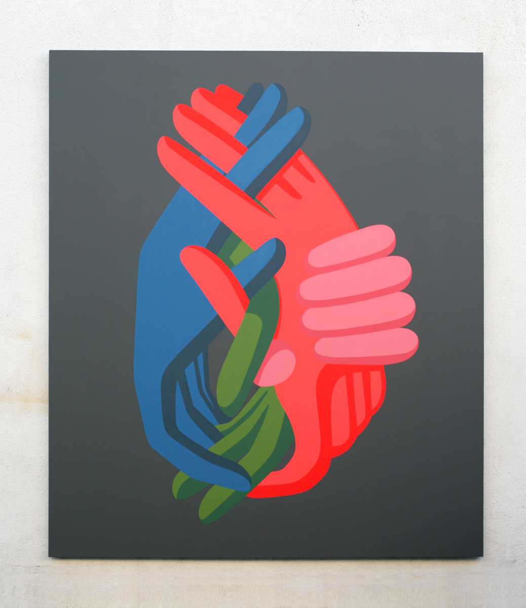
( reblogged from http://coopercolegallery.com/imgs/artwork/listing/CC_Geoff_McFetridge_3x3(DealingWithAbstraction).jpg )

This piece by Geoff McFetridge shows my appreciation of more graphic illustration as well as tendency to use more minimalist approaches in both colour and composition.


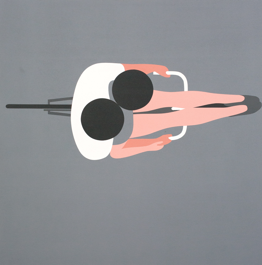
( reblogged from http://www.jeanjullien.com/work-91-books.html)
Again this piece plays into my minimalist approach, however the main reason I have chosen this image by Jean Jullien is because of the playfulness he uses to create visual metaphors. This is a method I try, but don't always succeed, to employ within my own work.


( reblogged from http://www.1zoom.net/big2/75/182776-Sepik.jpg )

Leading on from this is my desire to create work that can be appreciated by multiple different audiences. The work of is the work by my child hood hero Albert Underzo who's Asterix and Oberlix comics, created alongside Rene Goscinny speak various different genrations through both clever word play/innuendos as well playful visuals.


( reblogged from https://s-media-cacheak0.pinimg.com/736x/c9/ba/2e/c9ba2e542c0a0da520b15baf897d052a.jpg )


On the other end of the spectrum I also enjoy work that is a lot more visceral with varied use of texture. In particular Anselm Kiefer's work has had a major impact on me particularly when I've been created work on a darker subject matter.


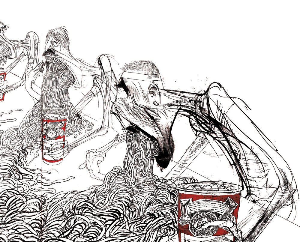
( reblogged from http://themicrogiant.com/wp-content/uploads/2014/04/ralph-steadman-1.jpg )

The work of Ralph Steadman best shows the way in which the various different visual and contextual ideas displayed above can be combined. This mirrors my desire to explore the possibilities of mixing different media/techniques/processes to produce work for a variety of different subject matters/contexts.


Monday 28 September 2015

Who am I? Why am I here? 

Geoff Mcfetridge


-Geoff Mcfetridge has been one of my favourite professionals operating within the world of illustration and design for several years now.
-For me the main draw to his work is his ability to communicate so much so clearly in a way which is both simple in design and immediate to the viewer.
-This is usually achieved through his minimalist approach to image making choosing to break figures and objects down into a series of basic shapes. However I feel it is his mix of subtle humour alongside masterful use of composition that truly set his work apart from others.
-These are aesthetics and approach image making have subsequently transferred to my own work. I feel this is indicative of my background in graphic design (having carried out work experience placements within a design studio in Sheffield during my Summer holidays) which has resulted in a tendency to seek out work that falls some where between illustration and graphic design.
-However I have decided, after having Geoff Mcfetridge recommended to me during the opening 'Mega Crit', that I need to in future expose myself to individuals/professionals operating at the other end of the wide reaching spectrum of illustration. This is so as to try and gain a more individual tone of voice as the fact that I was recommended Mcfetridge's by strangers who have no knowledge of my background or preferences would suggest that there is perhaps too much of his work in my own.


Images re-blogged from: http://championdontstop.com/site3/gm.html


Sunday 27 September 2015

La Boca - It was on Earth that I knew joy (film poster)


(re-blogged from http://site.laboca.co.uk/It-Was-On-Earth-That-I-Knew-Joy)

Context

-Poster created for the release and promotion of a short film.
-The film itself is short in duration and lacking any solid plot line meaning the image would have to communicate a key concept rather than narrative.
-Film was screened at a variety of independent film festivals
-Therefore the image would have to work well/be legible from a distance so a s to draw in viewers
-It would have to be able to convey the themes of the film in a way that is immediate enough to leave a lasting impression on people passing by.
-Furthermore the posters at such festivals are usually sold on as one off prints during the festival so the final piece would also have to work as a bespoke piece of artwork.

Ideas

-The film is a piece of surrealist science fiction.
-It depicts a series of scenarios  that all focus on the manipulation and subversion of both the individual and society due to external influences.
-These include the use of prescribed medication, outbreak of disease, the power of technology and use of propaganda.
-Therefore the image has been created in a style reminiscent of seventies science fiction films and b movies.
-This was achieved through the choice of typeface, minimal colour way and over all graphic aesthetic of the image all of which give a very retro feel to the image.
-The main idea behind the image is that of the hand of an external and unseen figure inserting something into the head of a man.
-This conveys the main concept of the film that is simple, immediate and effective.
-Particularly the decision to make the hand both off centre and contrasting in colour and tone to both the figure and background helps illuminate it from the rest of the image giving the viewer the sense that this is where the power lies.

Image

-A variety of methods could have been made to create the final image.
-This is due to the fact that La Boca's portfolio contains work created with a variety of different approaches and media.
-Given both the aesthetic (block colours sitting upon a textured background) and context of the image (film poster) I think the final piece was screen printed.
-However the image could have also been made through the use of paper cut outs. Both the grey hand and the deep red of the background, whilst been block colours, have a consistent and distinct texture running through them that would suggest the use of textured paper.

-


-